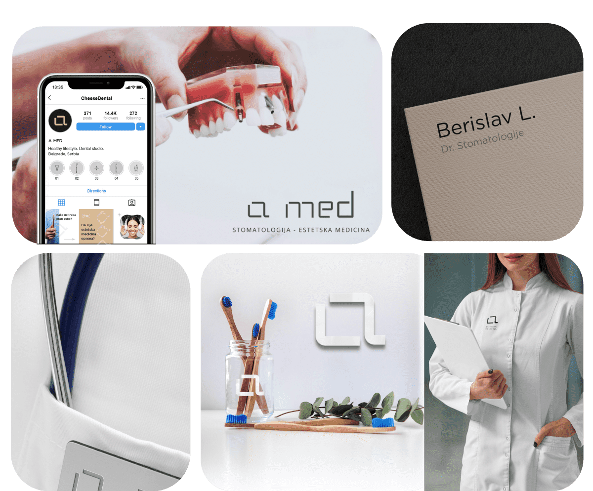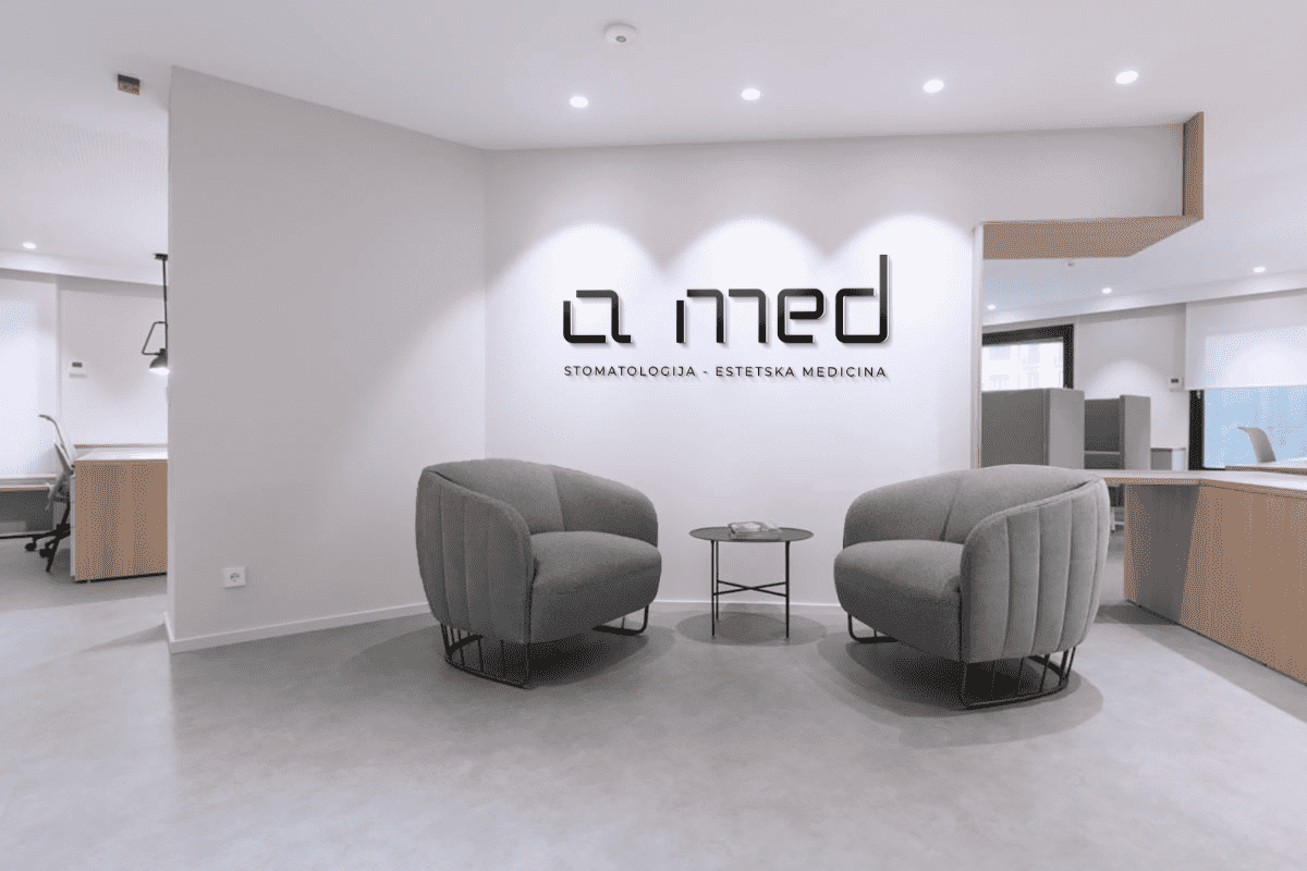
- CLIENT : A MED - Dentistry & Aesthetic Medicine
- SERVICES : Logo Design - Brand Identity
A Med - Dentistry & Aesthetic Medicine
A Med is a family-oriented business that blends two types of medicine: dentistry and aesthetic medicine. With over 15 years of experience in each field, they’ve decided to launch their own practice to provide comprehensive services. The new office reflects their approach—clean, minimalist, and modern—bringing together both industries under one roof. We were delighted to support them in the beginning and to help lay the groundwork for their brand identity.
Our approach
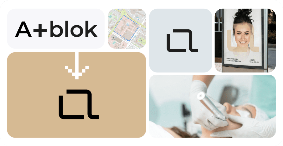
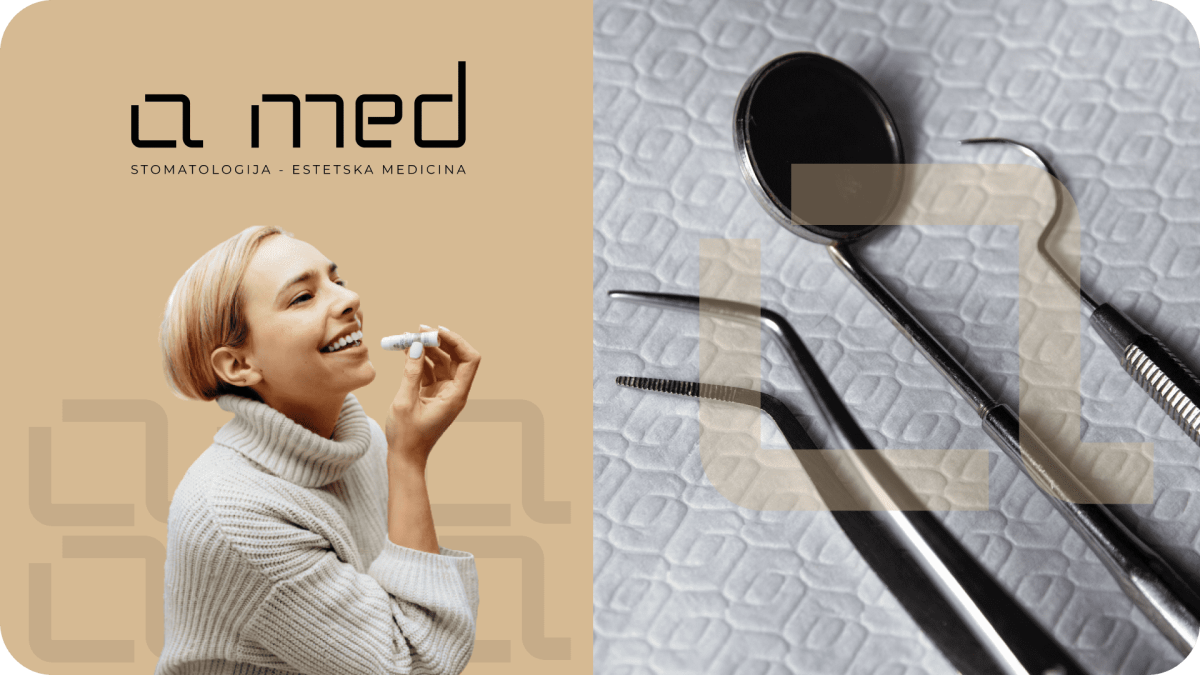
The approach to creating the logo for their business began with minimalist ideas, focusing on finding a suitable font and creating a symbol for “A MED.” Knowing they needed a recognizable element, we aimed to establish a direction that offered a slightly abstract design while staying within stylistic boundaries. The concept originated from the location of their business, a place in Belgrade known as “The Block,” which, from a bird’s eye view, resembles a square with rounded edges.
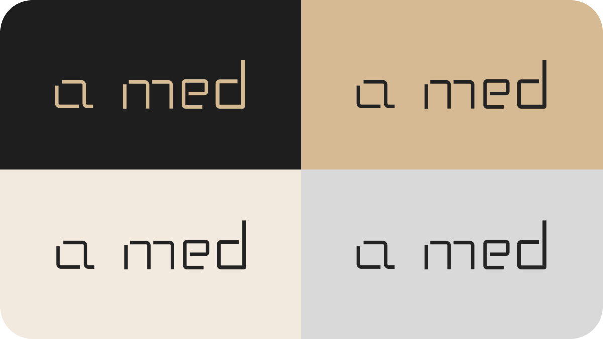
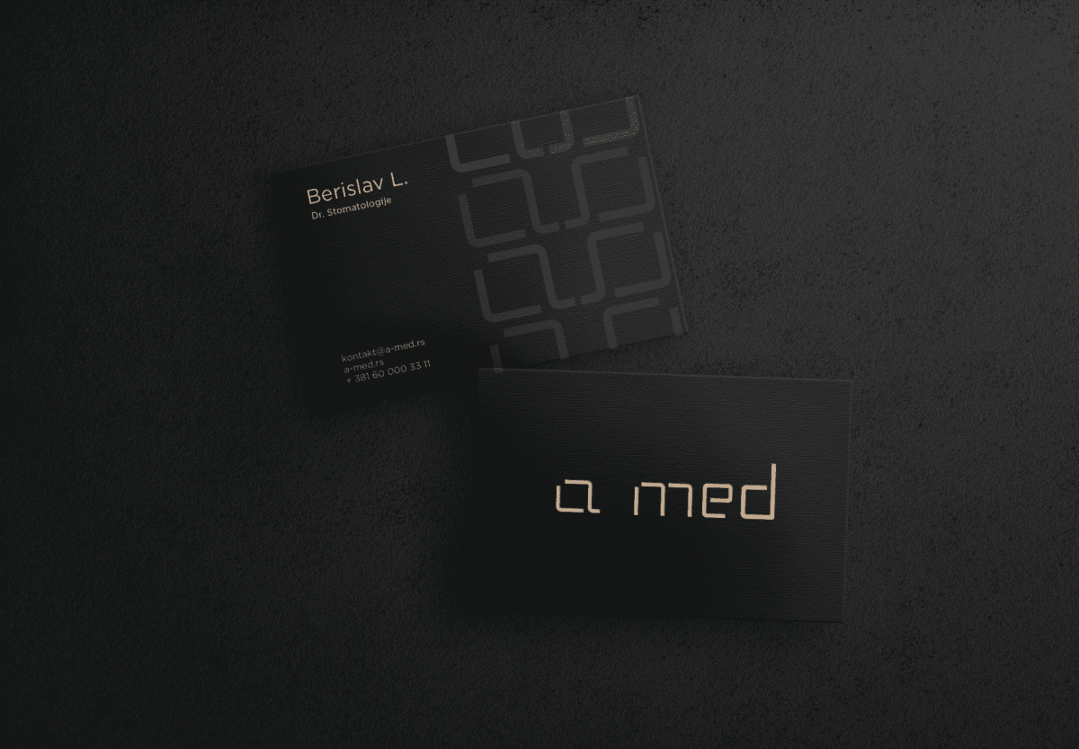
Building on this, we derived the idea to edit this shape, aligning it with the letter “a,” which is the key symbol of our logo. By modifying this symbol, we later developed an entire font for the word “A MED.”
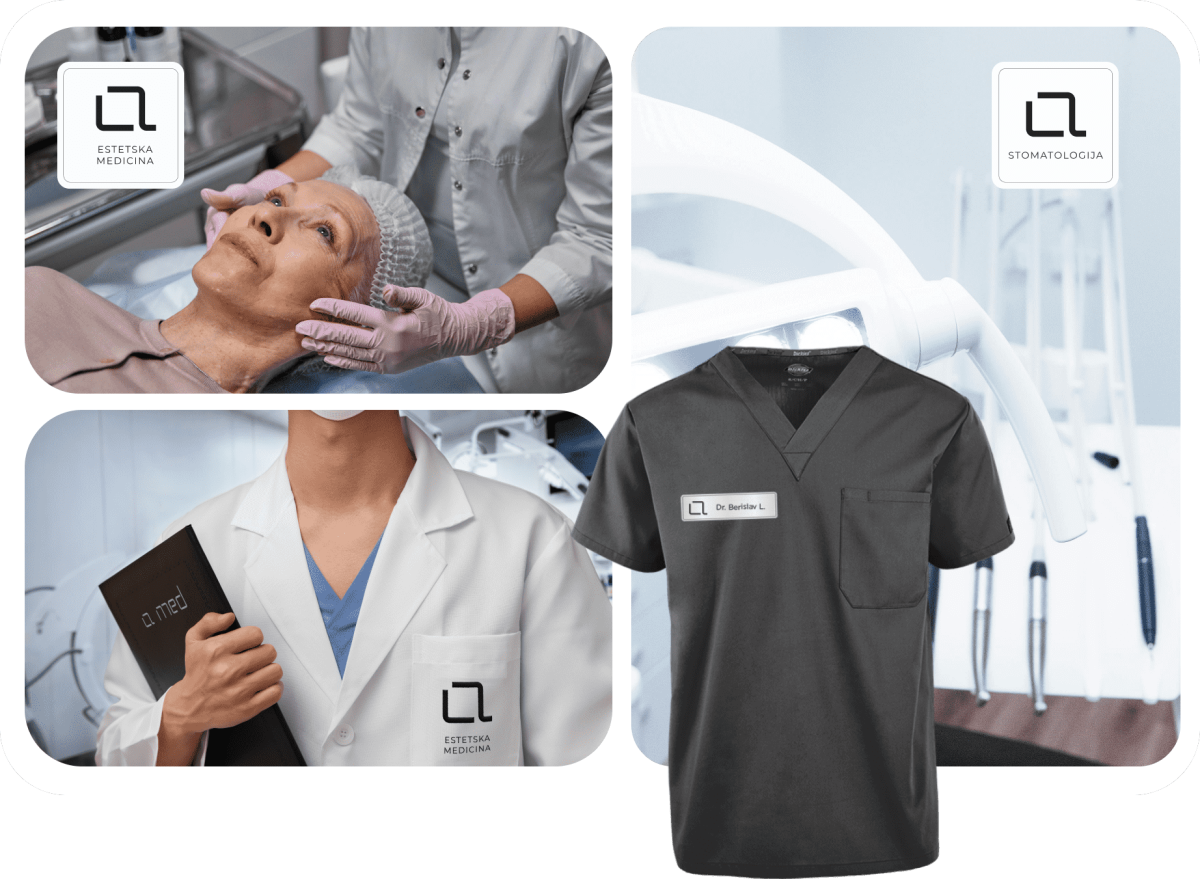
The logo adapts to the whole identity, allowing the “A” symbol to stand alone with “Dentistry” or with “Aesthetic Medicine.” This creates two separate identities within one branding concept, which was the goal.
