- CLIENT : Export City
- SERVICES : Brand Identity | Web Design & Dev.
Export City - Rebranding
The company employs over 400 workers, and the production takes place in their own newly constructed facilities spanning 30.000 m², equipped with modern equipment from leading global manufacturers.
Despite their success, Export City faced challenges with their online presence. Their website was outdated, with poor user experience and weak optimization, which did not adequately represent their quality and potential.
We were delighted to accept the opportunity to undertake a complete rebranding for this renowned company in the furniture industry. Our goal was to create a new visual identity that better reflects the values and quality of Export City, as well as to improve their digital visibility and overall user experience.
Main challenge in this project
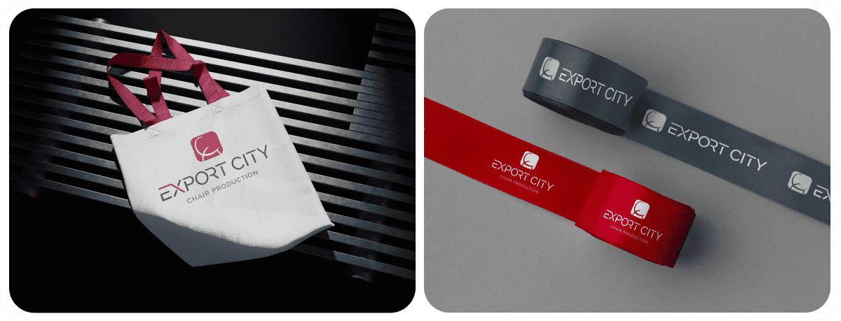
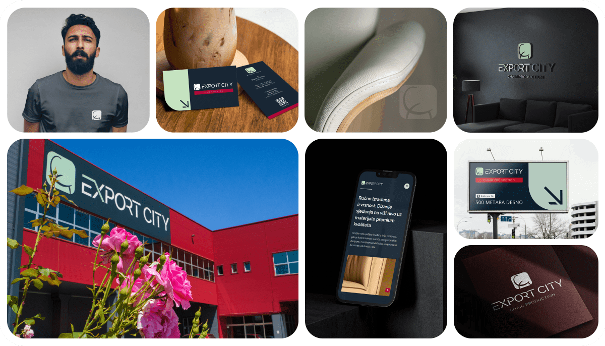
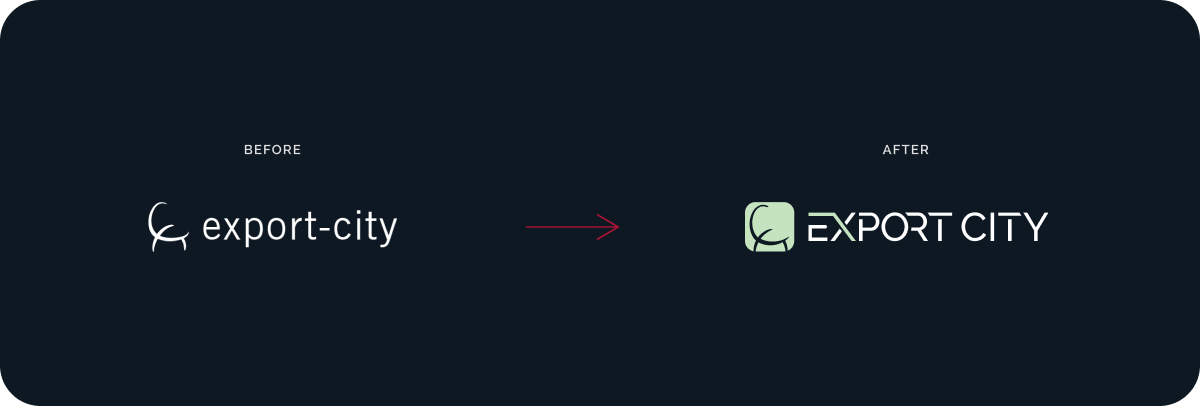
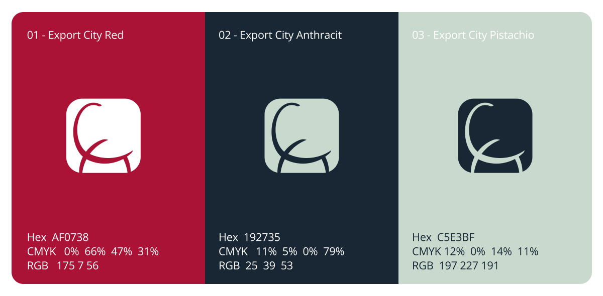
The main challenge in rebranding Export City was to preserve the essence of the old logo, its context, and direction, while simultaneously modernizing it. We worked on adapting a new font and building an entire visual identity around the rebranded logo. Special focus was placed on two new colors, anthracite and pistachio, which we carefully integrated into every aspect of the visual identity.
Additionally, the website was outdated and did not adequately represent the company’s potential or its relationship with the target audience. The processes were not clearly presented, making it difficult for users to understand how the system operated. The user experience (UX) was poor across all parts of the website.
Another issue was the lack of a portal for receiving new applications for open positions. This caused communication difficulties with potential candidates after advertisements were paid for, as there was no online application system available.
How we approached this project
Our concept, approved by the client, was to stylize the old logo and transform it into a versatile symbol that could be used across various backgrounds and integrated into the visual identity.
Given that the company specializes in manufacturing chairs, it was crucial for us to ensure that the logo and identity reflected the elegance and modernity of their end products. We approached the design by combining sharp shapes with rounded lines to achieve a harmonious balance. The logo features rounded elements, symbolizing the shape of chairs and the letter “E,” while the rest of the logo was designed with a custom font that highlights cuts reminiscent of the manufacturing process—cutting, shaping, and assembling—adding a final touch that merges production with elegance.
We carefully selected the colors; pistachio was introduced to complement the red and anthracite, maintaining rhythm and harmony throughout the visual identity.
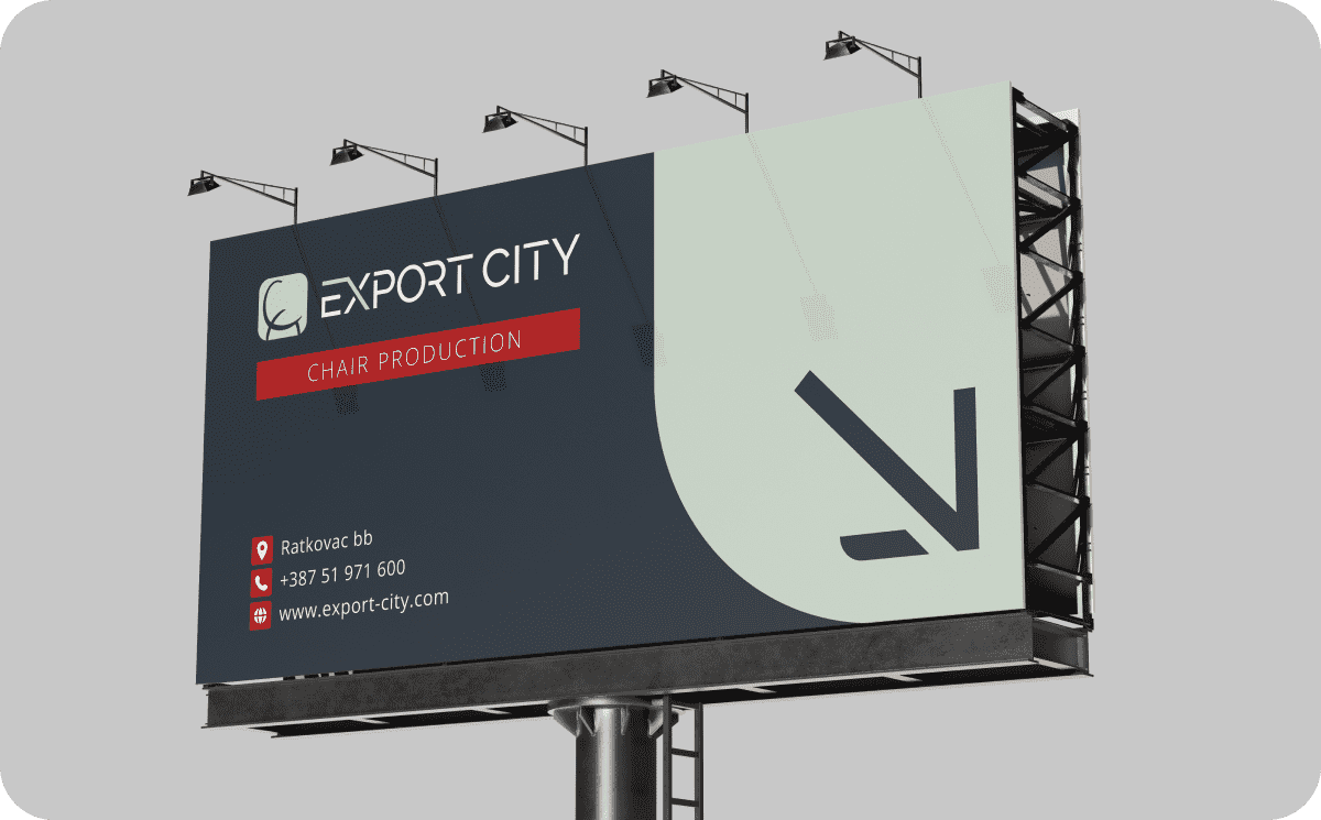
For imagery, we opted for clean and clear production shots, incorporating some rounded elements with arrows that represent export, while arrows in the opposite direction symbolize the import of raw materials and supplies.
Website design and development
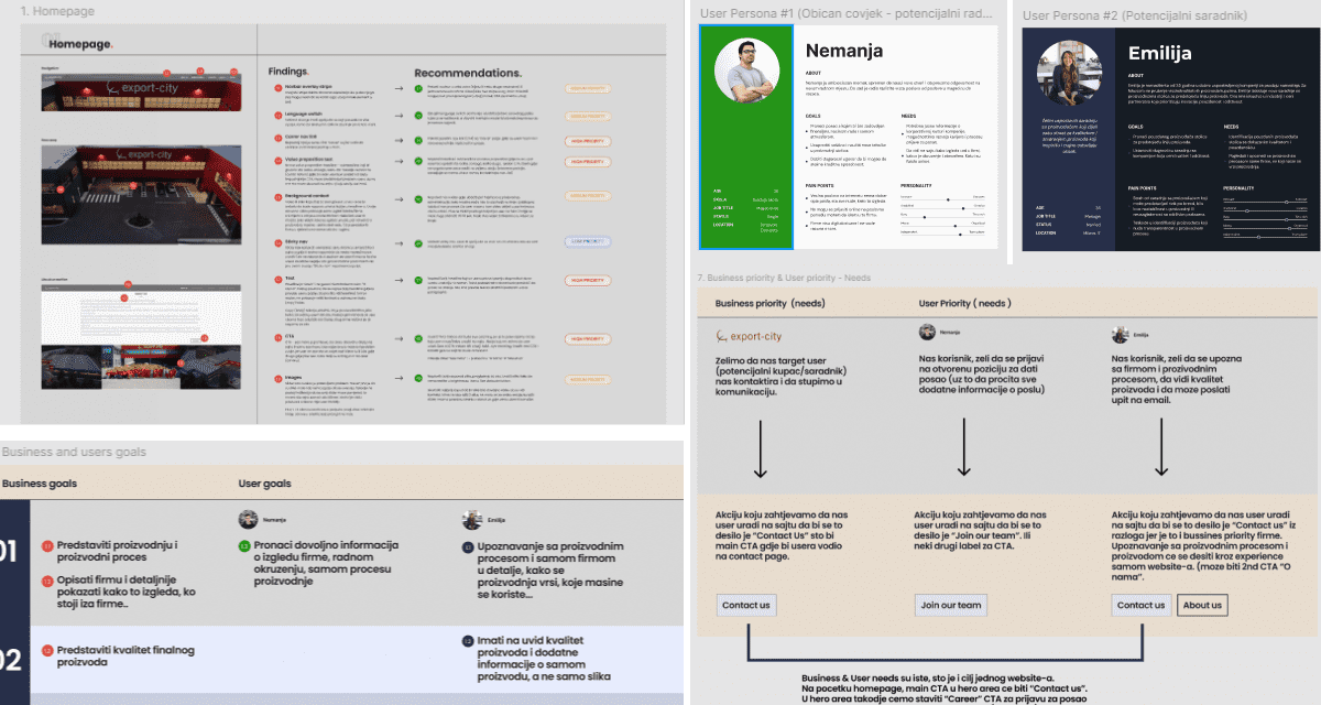
The website design process began with an audit of the existing site to identify areas for improvement, assess target users, and define desired user actions. We also conducted research with business stakeholders to understand their goals for the site and its business purposes.
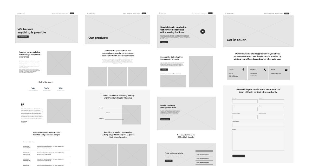
Following the research and mapping phase, we proceeded to sketching and wireframe development. All pages were created in the gray phase and presented for review. After approval, we explored three different design directions. After consultations with stakeholders, we selected a direction, designed the entire site, and prepared it for development.
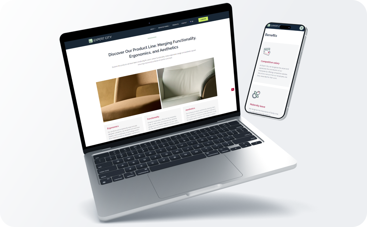
The development phase was then completed, resulting in a website that effectively showcases everything Export City offers, including a portal for new employee applications.
